Svelte Color Picker

Simple color picker made with Svelte
directly inspired from https://github.com/BennyAlex/material-design-inspired-color-picker
npm i svelte-material-color-picker
Usage
<script>
import Picker from 'svelte-material-color-picker';
</script>
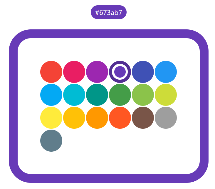
<Picker on:colorChanged {margin} {size} {colorsPerRow} {defaultTint} />
Props
Full list of props/bindable variables for this component:
| name | default | description |
|---|---|---|
margin |
1 | Distance between color circles. |
size |
50 | Size of the colors circles. |
colorsPerRow |
6 | Number of color circles per row. |
defaultTint |
500 | Default tint displayed for each colors. |
selectedColor |
#f44336 |
The color selected, hex code with hashtag. |
mode |
palette |
The mode of the color picker. button mode will hide after the palette after selecting a color only showing the color circle of the selected color. palette mode with show the palette and highlight the selected color in it. |
palette |
link palette | The palette used by the picker. |
Events
Picker.svelte dispatches the following event:
| name | detail | description |
|---|---|---|
colorChanged |
{ old:string, new:string } |
Triggers when clicking on a color picker. |
<Kanban
  on:colorChanged={(e) => alert(`Color changed from ${e.detail.old} to ${e.detail.new}`)}
/>
Dev Mode
git clone https://github.com/V-Py/svelte-material-color-picker
cd svelte-material-color-picker
npm install
npm run dev
